Circle for Roommates
Circle for Roommates is a mobile application that helps users find a verified, trustworthy roommate. In the early 2019, I designed a new map feature and relavent illustration and animations that help users to encounter housing solutions in fun and interactive way.
Scope of Work
UI/UX Design
Illustration
Motion Graphics
Interaction Design
Challenge
New feature, new design
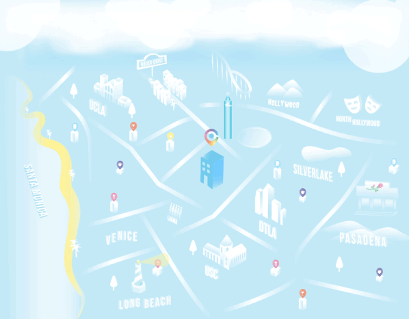
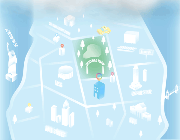
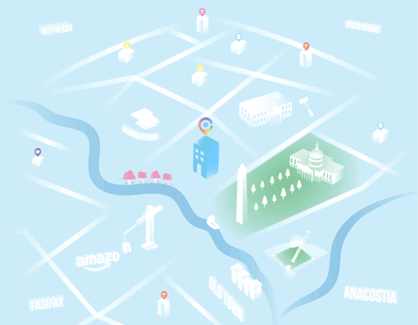
As many roommate finders have been coming into Circle, the company decided to scale up and target the real estate market to provide users with housing solutions. Therefore, they needed to add a new Map feature to the core product so that users would discover the featured apt property on the map. Also, the company would want to improve their product with a more delightful user experience.
Goal
Keep the young voice of Circle, revamp with innovation
Circle app communicates to the young professionals who are interested in living with another. Without losing the existing voice, we needed to bring an innovative way that allows users to encounter housing solutions.
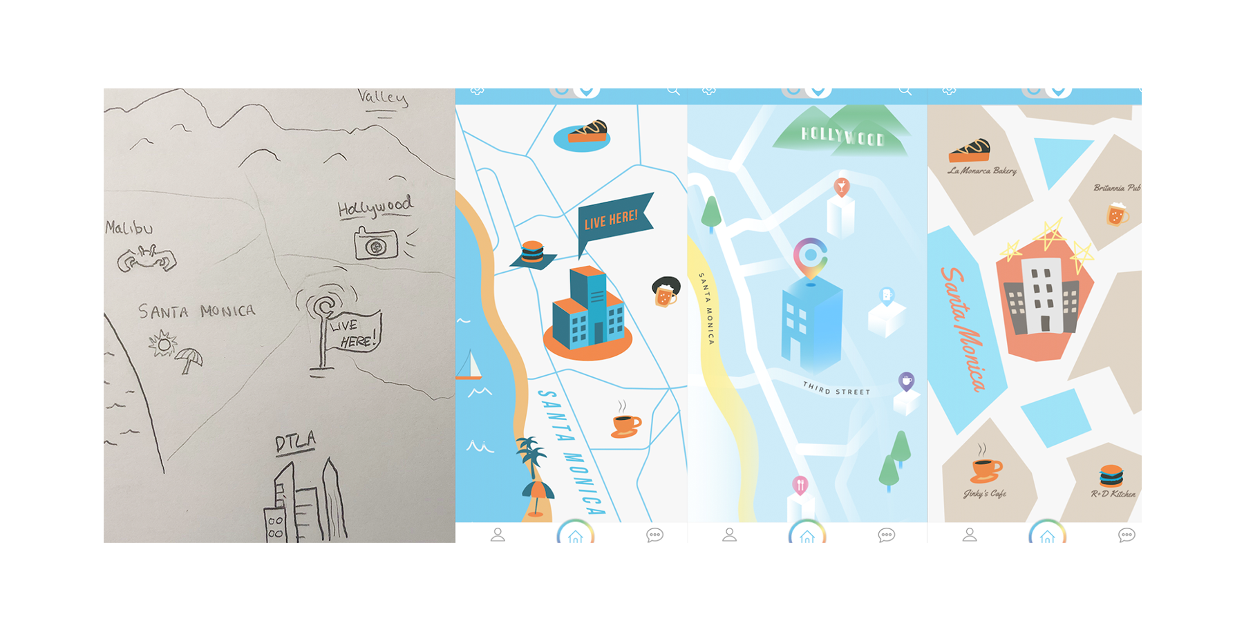
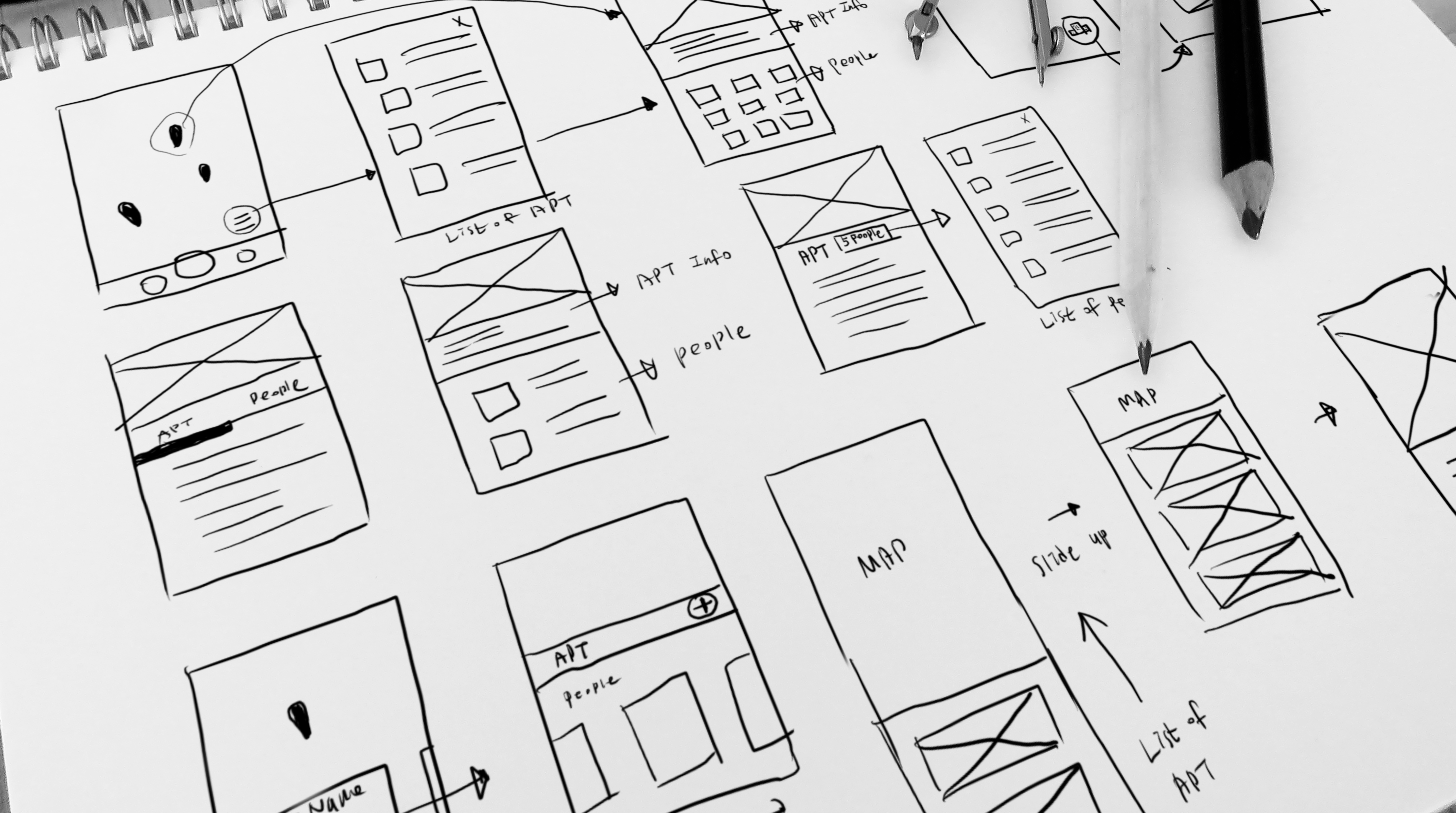
Process 1.
Wireframes
The first and most, we needed to figure the small ux flow from the map to the apartment detail page. I first began with high-level sketches to get rough ideas on paper before diving into the details.
Early Design Iterations
After throwing ideas and flows onto paper, I began designing variations in Sketch.
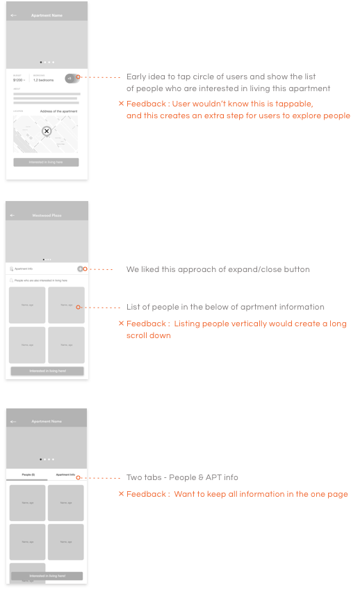
Exploring apartment
information
I continuted to deep and dive into the suitable layout for the apartment detail page.
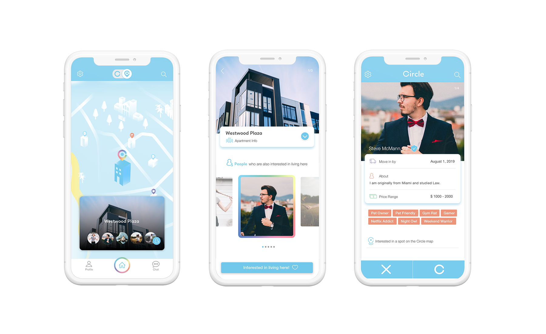
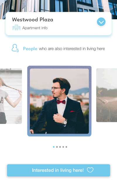
Final Page Designs
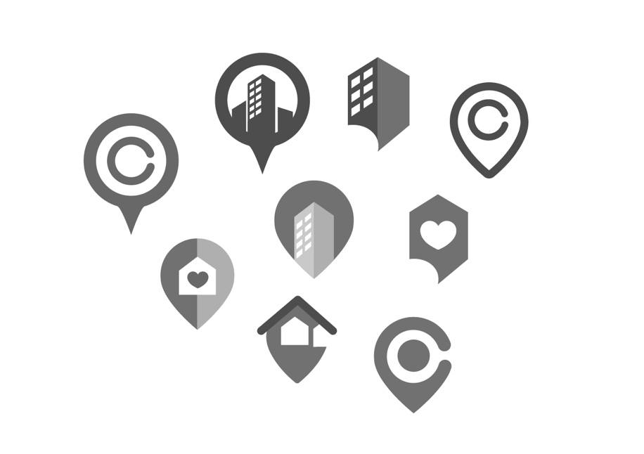
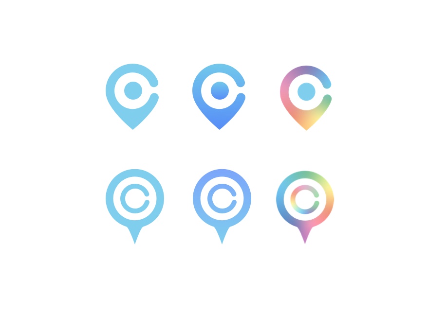
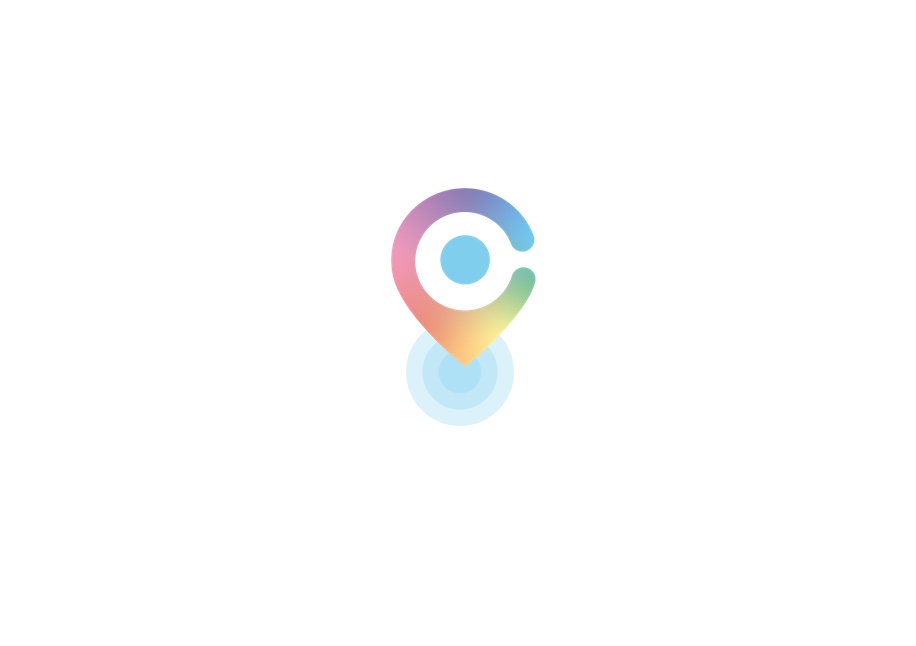
Process 2.
Micro Interactions
Part of this project was also taking into consideration the entire map experience. New interaction had to be accounted for fun and delightful experience.
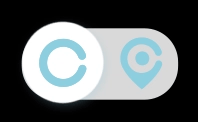
Animated Toggle Button
Because the map page is the brand new feature in the app, the client wanted to highlight it in a simple way. The fun toggle interaction creates additional enjoyable moment for users.
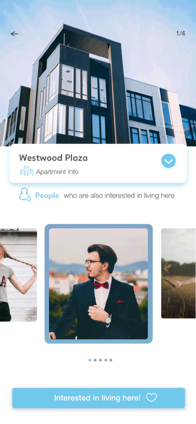
Apartment Detail Page
The subtle moving box brings user's attention and encourages them to open for more detail.
Swipe Animation
The smooth swipe animation brings delight to the user.